Shakespeare famously said that a rose by any other name would smell as sweet. But what about a rose of any other colour? Would it look as appealing?
We all know that a red rose means something very different to a white one, or a yellow one, and each creates very different emotional responses. And when it comes to giving roses, you don’t want to get it wrong!
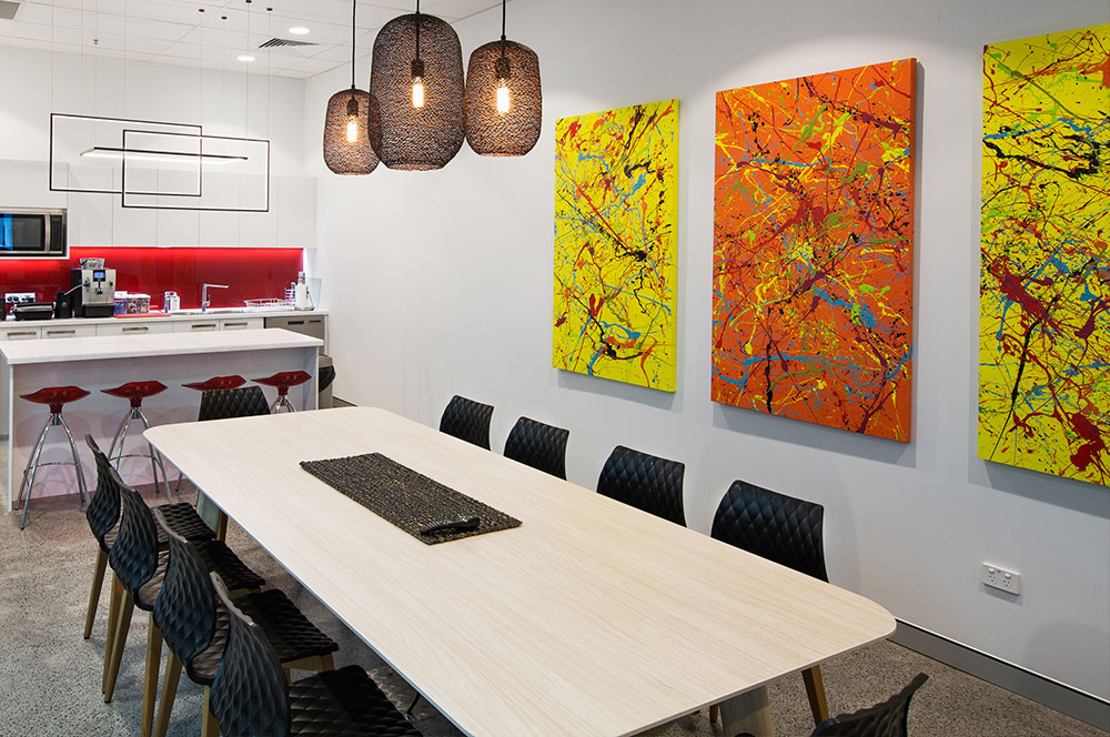
Emotional responses to colour are likewise an essential consideration in designing any workplace. You want to ensure that you’re getting the best out of your staff and for that to happen they need to feel comfortable in the work environment you’ve created for them.
Comfort means paying attention to the physical layout and set-up of the space, design of fittings, furnishings – and colour. You also want them to feel positive and motivated. Again, the colour palette and combinations you choose are going to make a difference.
Various studies have shown that colour affects not only mood but also productivity, performance and job satisfaction. We’re all familiar with common beliefs about colour – that red is energetic; blue and green are calming; yellow is optimistic and uplifting. It follows that red will draw attention and inspire action; blue and green will improve efficiency and focus; and yellow will trigger innovation and creativity.
A fascinating study published by the University of Texas has gone one step further to really unpack the influence of colour on performance and wellbeing. They explain that along with bad lighting, glare and inappropriate design, distracting colour choices can cause visual discomfort – where the basic functions of the eyes have to work against interference. They go on to show that colour has a huge impact on the way we perceive our interior environment, and that there are differences in the way colour affects different people’s moods and productivity, but not necessarily in the ways you might think.
The whole subject of colour and visual comfort is one that’s worth some extended consideration, so I’m going to explore it in more detail over a series of three more blogs. Above all what the University of Texas study proves is that colour is important in office fit-out and design and its influence can’t be underestimated. You want to get this right, so it’s definitely worth finding out why.
Bryan Palmer