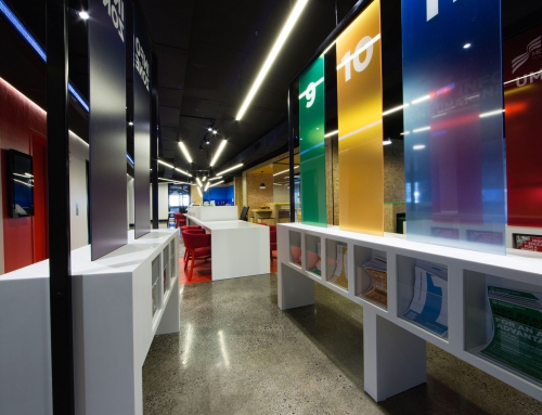
A unique study conducted over 20 years by a team from the School of Architecture at the University of Texas examined the influence of colour within the office environment to properly understand how it affects those who work in it. They ran a series of four intriguing experiments, with some unexpected results.
Study #1: Colour of interiors on productivity and mood
This experiment focused on the effect of colour on the performance of tasks and general mood. Participants were given typing tasks in rooms painted red and blue. They either stayed in one room, or spent half their time in each room. There were equal numbers of men and women, with an even spread of ages.
- Performance – those who moved from the blue office to the red office made more errors than anyone else, women especially.
- Mood – responses showed that the red office was associated with anxiety, and the blue office was associated with depression. Changing colour acted a stimulus, leading to increased arousal.
Study #2: Performance, mood and preference
This experiment assessed the effects of three different colours on productivity, mood and preference. Participants were seated in one of three testing offices – painted red, white or green – and asked to complete a series of tasks.
- Performance – participants in the white office made more errors than those in the red office.
- Mood – participants in the green office finished feeling more confused than those in the red office.
- Preference – Participants in the white office said that they liked working there more than those in the red office. There was no difference between those in the red and green offices. More men than women found the red and white offices more distracting, while more women found the green office distracting.
Study #3: Effects of monochromatic colours on performance and mood
This experiment was about comparing the effects of colour vs netural tones on performance, mood and preference, particularly the effects of different colour saturations and warm vs cool colours. Participants were asked to complete tasks in rooms painted one of nine colours – red, white, green, orange, yellow, blue, beige, grey or purple.
- Performance – participants in the dark painted offices (red, blue, green, purple) made fewer errors than those in the light offices.
- Mood – men felt more depression, confusion and anger in the brighter offices, while the opposite was true for women, their mood was negatively impacted by the duller offices.
- Preference – the majority of participants preferred working in the white and beige offices (though they made more mistakes there), and most disliked the orange and purple offices.
Study #4: Impact of colour schemes relative to individual environmental sensitivity.
This experiment looked at how different colour schemes affected mood and performance over a four-day work week. Three offices were created to replicate realistic colour schemes, one predominantly red, one predominantly blue-green and one predominantly white. The study also took into account individuals’ ability to screen and filter external stimuli.
- Performance – participants who were low screeners (more affected by their environment) performed worst in the predominantly red office and best in the blue-green office, while the reverse was true for high screeners.
- Mood – participants in the red office, particularly low screeners, felt more depressed than those in the blue-green office. Low screeners also reported more anger and depression than high screeners in the white office.
- Preference – participants, particularly high screeners, in the white and blue-green offices reported higher job satisfaction than those in the red office. The blue-green office was most preferred overall.
There’s a lot to take in, in all that. So what does it tell us?
The number one lesson here is that how colour affects our visual comfort in a work environment differs from our common beliefs. In my final blog on colour and visual comfort, I’ll explore what we can take away from the evidence of these experiments to decide on the best colour scheme for your work place.
Want to read more about the University of Texas experiments? Read the full write-up here.
Bryan Palmer

