Colour and the ways it is used in interior design has an impact on how we feel and how well we perform in that environment, there’s no doubt about it. But our preconceptions and common beliefs about how exactly colours will affect us don’t always hold true.
The rigorous long-term study conducted by academics at the University of Texas provides us with reliable evidence for colour theory and how colour affects workers in an office environment.
The key findings of the study are:
- While colour may impact mood there is actually no link between mood and performance. This means that colour can have quite independent impacts on mood and performance, so you need to choose colours to either lift the mood or increase productivity, not both.
- White has typically been discounted as an option for increasing productivity, but most people prefer white in the office environment and believe it will increase their performance. This is not always what actually happens though, so it makes sense to strive for a balance of colours that people will both like and be positively affected by.
- Colour characteristics and/or the degree of brightness in colour schemes will affect men and women differently. In creating an inclusive working environment it is important to ensure that colour tones and palette are chosen that won’t negatively impact either gender (women won’t like dull colours; men won’t like them too bright).
- Each individual’s environmental sensitivity (their ability to screen and filter external stimuli) will influence how they are affected, and how they perform, in a particular colour scheme. High screeners will respond positively to colour in the work environment, but low screeners will find too much colour distracting – balance is essential.
Designing an interior colour scheme that will accommodate every individual’s different characteristics and meet all their needs is – inevitably – pretty much impossible. What’s most important is to strive for balance in an overall design that achieves the broadest possible aesthetic appeal.
Every office environment is different, as is the mix of staff and clients who will use it. What you’re aiming for then, when deciding your colours, is a harmony between function and purpose that will accommodate – and be positively received by – as many people as possible.
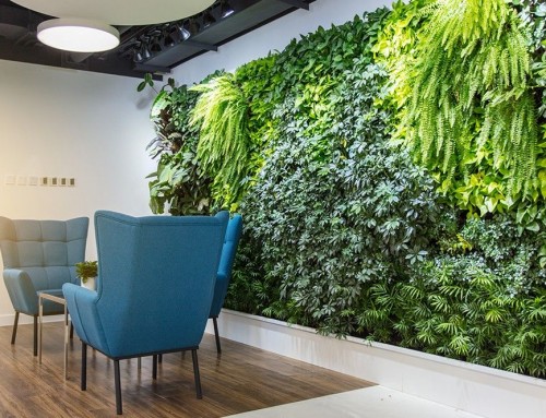
Remember, you’re striving for visual comfort – you want your staff to feel comfortable in the work environment you’ve created for them, and you want them to feel positive and motivated. By all means throw in some red for energy, splash about some optimistic yellow, and inspire calm with blues and greens. But choose carefully where and how you use each colour within the overall design scheme. Build in some flexibility wherever you can, so that individuals can make adjustments to suit themselves, and you can be confident of happy staff achieving the best possible results.
Bryan Palmer