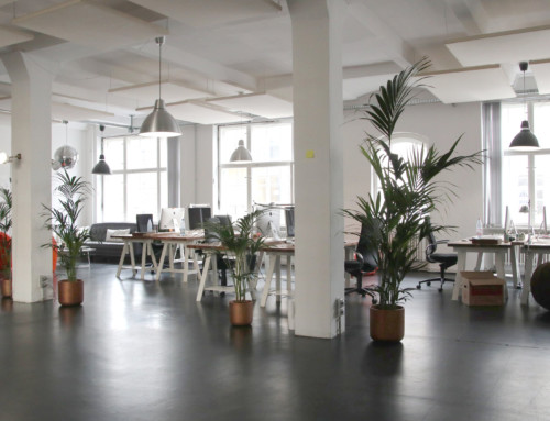
Colour has a direct impact on psychological wellbeing and productivity in the workplace. So it’s a key consideration in office and workplace design and planning.
The authors of a study done at the University of Texas go so far as to say that designers have a responsibility to create harmony between colour and the intended functions of a particular space. That’s because getting it wrong can have real impacts.
Colour has three functions, and each serves a purpose that needs to be factored in alongside colours’ effect to create visual comfort for staff and employees:
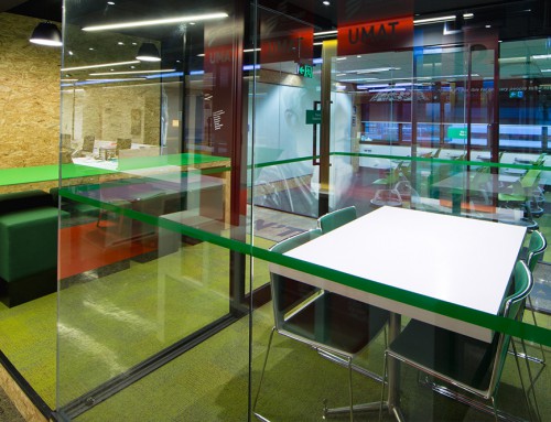
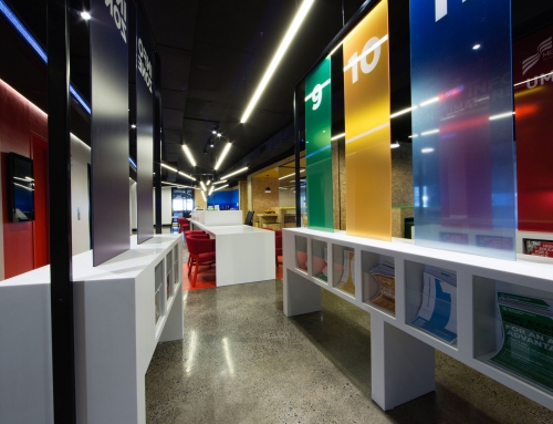
- Indicative – colour can be used to quickly and effectively explain the function and utility of an object. For example, red and blue on kitchen and bathroom taps indicate hot and cold.
- Symbolic – colour also communicates intangible qualities that we understand through our culture and the world around us. For example, red – the colour of roses and love hearts, fire engines and sports cars – can be used to communicate passion, energy and urgency.
- Aesthetic – colour is used for decorative purposes, simply to please the eye. This has been true in art and architecture throughout history, with different combinations of colour, their contrasts and harmonies, used to satisfy shifting ideas of beauty.
Colour also has psychological impacts:
- Emotional state – it’s a common belief that colour affects our emotions. Warm colours – red, orange, yellow – are associated with active emotional states. Cool colours – blue, green, purple – are associated with restful emotional states.
- Physiological state – it’s a common belief that different colours are associated with different temperatures: we’ll feel hotter in a room painted red and cooler in a room painted blue. Though studies have shown that colour doesn’t actually impact thermal comfort, we still believe it does – it has a psychological impact.
Common beliefs, like all of those above, lead to assumptions about colour and how it should be used in workplace interiors. But we need to be careful, many of them are actually myths or misconceptions.
A good example is the “pink prison” experiment in the USA in the 1970s. Pink is assumed to be a soft, feminine colour. Male prison inmates were placed in holding cells painted pink and were found to be less aggressive. The idea was adopted by other prisons around the world but when the experiment was actually replicated the pacifying effects couldn’t be proven.
We need to put aside our preconceptions, then, and question our notions about colour. So what’s really going on? The University of Texas asked the same question and conducted a series of experiments over 20 years to answer it. I’ll talk you through what they found in my next blog. The results may surprise you.
Bryan Palmer